“Graphic design will save the world right after rock and roll does.”
David Carson
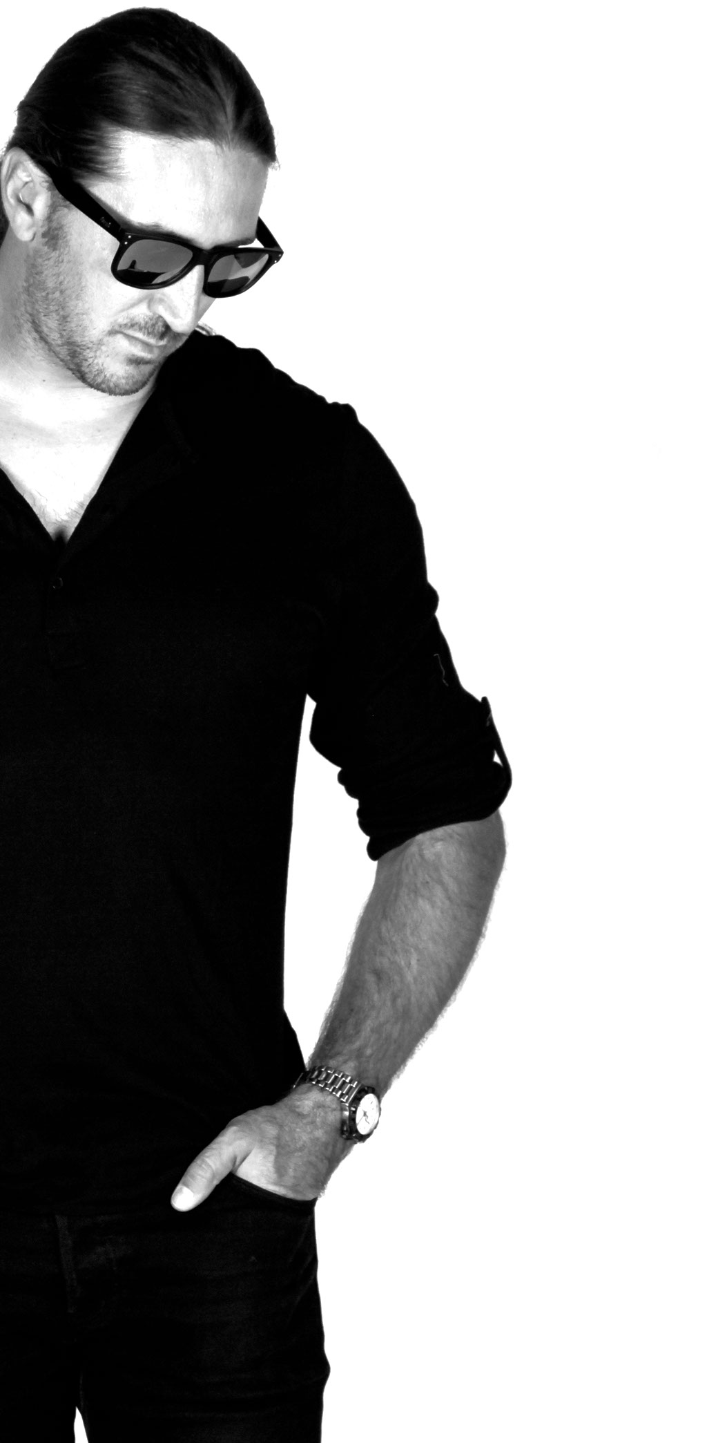
Hi there!
Welcome to my site
I'm Anthony and I'm a Freelance Graphic Designer. Designing has given me the opportunity to be part of exciting, unique and sometimes strange projects and has also led me to meet and work with amazing designers, developers, and organisations.
My love for all things arty and design began way back in high school. A self professed perfectionist and someone who has a tendency to think way too much, design seemed like a logical career path and its been great fun ever since.
This website is my design portal. Samples of my design work can be seen in the portfolio section below. My resume is also available to view.
Enjoy your stay. If you have any questions, please message me.
Graphic Design • Corporate Branding • Advertising
• Packaging • Websites • Logos • Newsletters
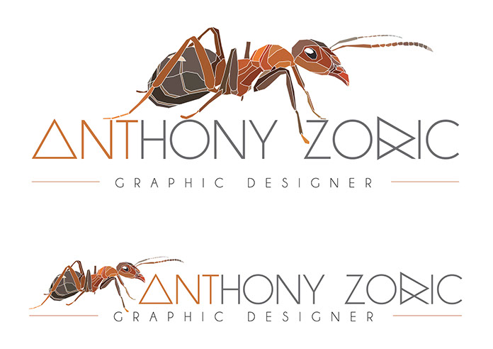
MY LOGO
For as long as I can remember, friends and family have always called me Ants’. I guess it was a no-brainer to incorporate the hard working little insect into a personal logo for myself.
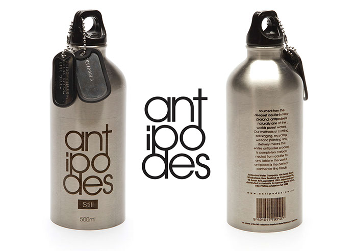
ANTIPODES WATER LOGO REDESIGN AND PACKAGING PROTOTYPE
Antipodes Water is a high-end bottled water mostly associated with higher income earners or a younger, single demographic with disposable incomes. Instead of the regular boring glass or plastic bottle, I opted for steel. To add something a little different, I had two dog tags made with one saying ‘ANTIPODES’ and the other with the companies slogan of ‘DRINK CHILLED. DRINK OFTEN. LIVE WELL.’
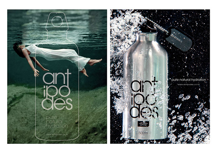
ANTIPODES WATER
BOTTLE ADVERTISEMENTS
I was asked to mock a full page advertisement to run in Australian Vogue magazine. Instead of opting to display the bottle within my advertisement, I thought displaying an outline of the bottle shape over a beautiful image would represent the brand well and sit well with the other high-end advertisers of the publication. I also created another ad that would be at home within a more masculine style magazine. The photograph was achieved by submersing the bottle in a full fish tank and pouring water over the top to create the bubbles.
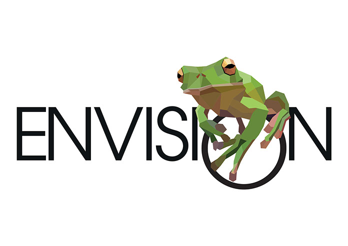
ENVISION LOGO
This logo was created for a competition. I'd like to say I won but I guess you can't win them all. The logo was to represent a design and art exhibition with student works on display.
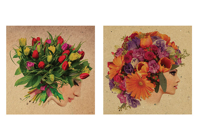
FLOWER WOMEN - 2 of 4
I like it when accidents happen and work. I was trying to achieve a double exposure but stumbled across this outcome instead, resulting in a series of four beautiful flower women. These were to be used on generic cards that would be sold at Sportsgirl in a pack of four at the front counter.
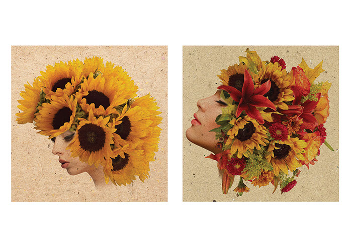
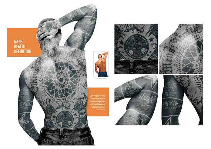
MEN’S HEALTH STATISTICS INFOGRAPH
Infograph’s are a great way of crunching boring data into a medium the pubic can easily digest without reading pages of text. This would look great printed in anything from medical journals, men's health magazines, on a poster in a doctors surgery or a hospital or even displayed on a website. I wanted to steer clear of vector styled infograph’s and do something a little unorthodox.
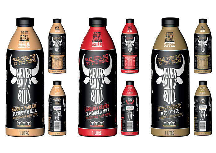
NEVER MILK A BULL FLAVOURED
MILK PROTOTYPE
With flavours like Bacon & Pancake With Canadian Maple Syrup, Carolina Reeper Hottest Chilli In The World and Triple Espresso Robusta & Arabica Coffee, these aren’t targeted towards children. The name was chosen as a tongue-in-cheek bit of fun. Being of its controversial nature, it’ll get people talking. The design is masculine. Colours were chosen to represent the flavours on offer. I wanted to steer clear of the regular flavours sold in flavoured milk varieties. My flavours are over the top and slightly crazy. A good dose of humour was incorporated into the copy on the bottle.
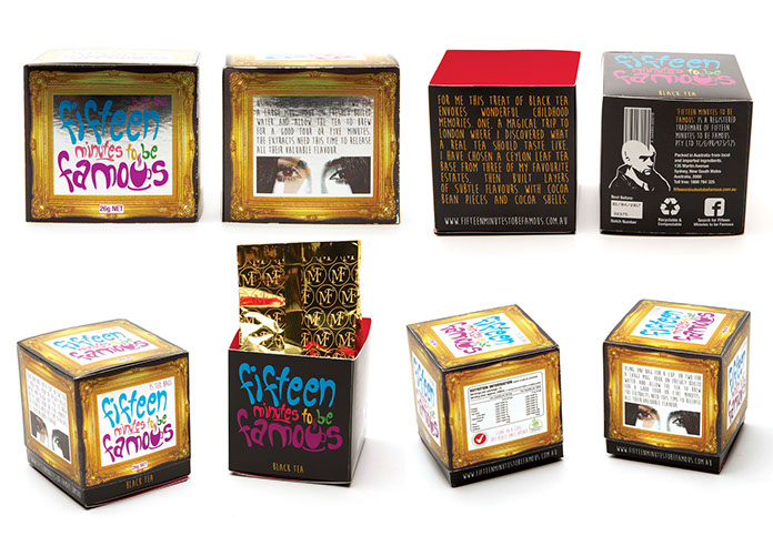
FIFTEEN MINUTES TO BE FAMOUS
TEA BOX PROTOTYPE
Taking inspiration from Andy Warhol and one of his most famous quotes ‘In the future, everyone will be famous for 15 minutes’, this tea box prototype is all about vanity. The top of the box is printed on mirrored cardboard to replicate a mirror. Overall, this high end tea branding isn’t targeted towards your grandmother in the nursing home but more towards the youthful, cafe cultured city crowd.
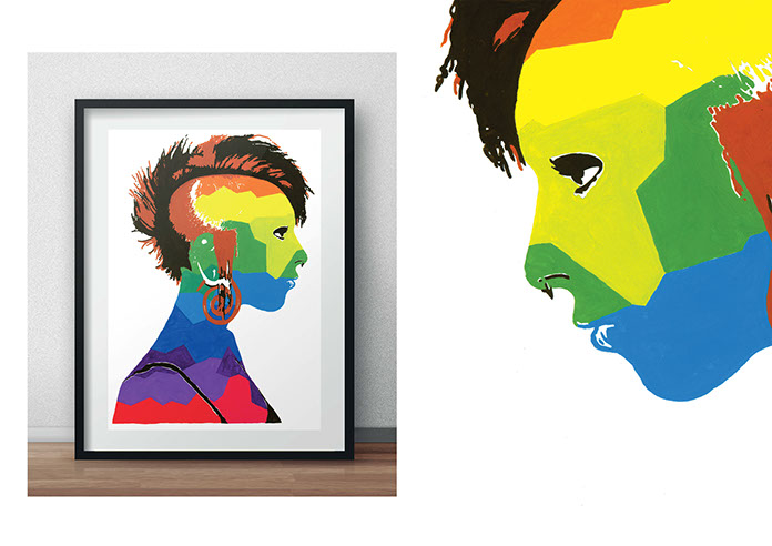
PUNK ROCKER PAINTING
After not doing any kind of physical art in years, this was fun to do. The goal? To create a painting of a reversed punk rock woman - her hair is normal coloured - her skin a rainbow of different colours.
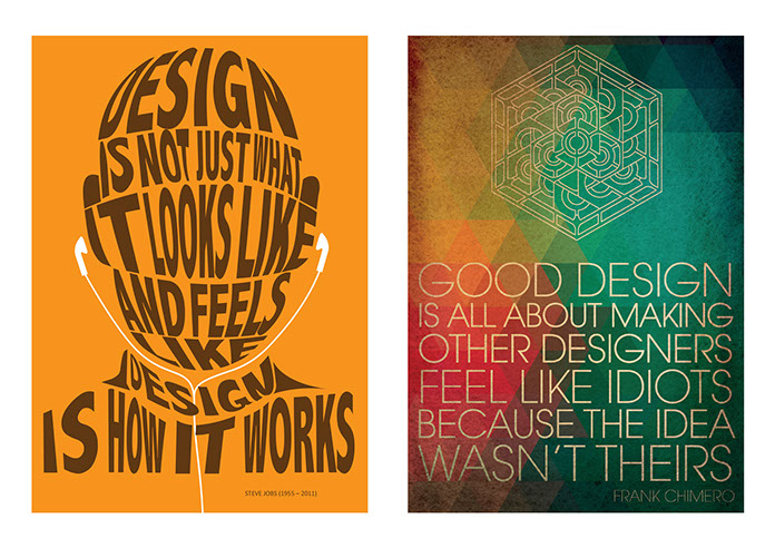
INSPIRATIONAL TYPOGRAPHY QUOTES
As the title says, these are inspirational quotes focusing on design. Both are different in execution and style. I think the quotes ring true with all designers.
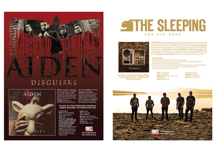
RIOT! ENTERTAINMENT ‘ONESHEET’ ALBUM PROMOTIONS
This was really fun work. Onesheets are information pages sent to record stores, radio stations and various publications to inform them of up coming album launches from both international and local bands that Riot! represented throughout Australasia. Liaising with Riot! Entertainment’s owner and their head PR representative, each page was tailored and designed with images from the record labels directly.
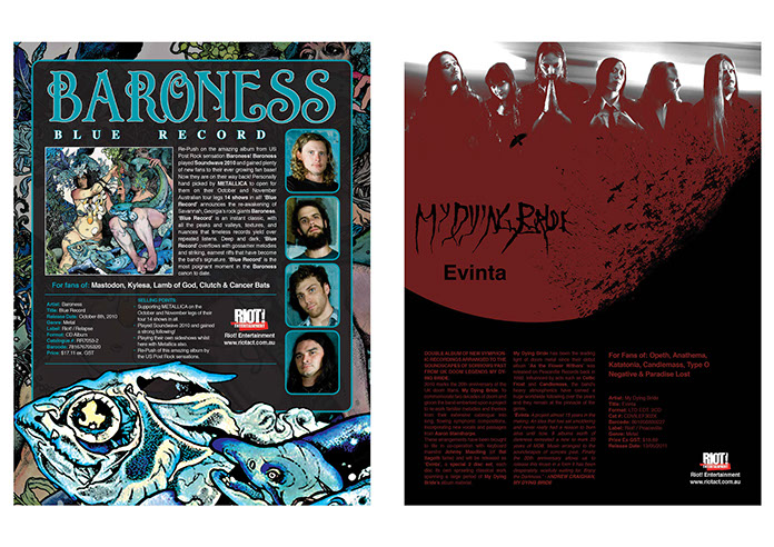
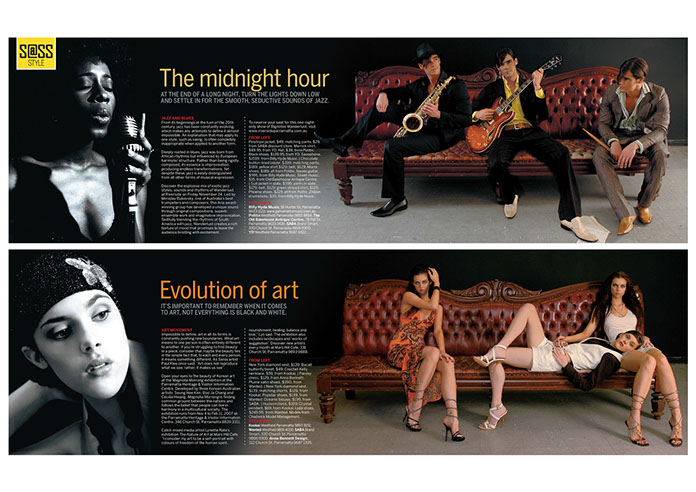
SASS MAGAZINE FASHION SPREADS.
SASS Magazine was a free street-press publication distributed around Parramatta’s CBD. Being the Senior Designer of the publication while working for News Limited, the fashion layouts were always fun to do. In this example, I liaised with our in-house photographer to achieve this effect. The beautiful Chesterfield lounge was set up in the studio with the camera mounted on a tripod, we had the models sit on different areas of the chair. If you look closely, its the same people sitting on the lounge. Pretty cool.
© Anthony Zoric Graphic Designer 2015
|
|
|
Let's stay connected.
Need some work done? Just want to say hello?
Message me. I’ll get back to you as soon a possible.
home
home
portfolio
portfolio
contact
contact